Babydo
Make raising a child a pleasure
What is Babydo?
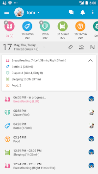
Babydo is an application that organizes activities with a newborn baby. It is dedicated to parents and occasional carers, such as grandparents and nannies. Thanks to the Babydo application, we can save information about the time and type of meal consumed by the infant, sleep time, time of defecation, or information about the medications taken. The main assumption of the application is its simplicity and intuitiveness.
The Problem
When using similar applications of this type, several basic problems have been noticed. Most of them have a very extensive structure, and most of the functions offered are not used by users. Parents usually have very little time to complete complicated forms for specific functions. Parents usually use the smartphone with one hand, because with the other they perform activities related to the care of the child. In most of the analyzed applications, the most important functions required the use of a second hand, which is sometimes impossible to implement.
Problem statement
Using the application is usually done with one hand, all functions above the reach of the thumb are difficult to access,
Due to the lack of time, too many functions discourage the user,
Bright colors of the application, displayed in the evening, can wake up the child from sleep,
A large number of duties of the user makes him forget about the obligation to give the child the medicine at a certain time,
No possibility to add additional users such as: second parent, babysitter, grandparents.
I have compiled some basic problem statements to better understand the pain points of the baby activity note app.
Research
The easiest way to check the requirements of potential users for this type of application was to interview the parents of newborns in my environment. An interview was conducted with 9 people:
5 females aged 25-35 (newborn 4-12 months)
4 males aged 25-35 (newborn 4-12 months)
The issues raised during the interview concerned the activities of children, which were controlled by parents while taking care of the child, what problems similar applications have, as well as private experiences and problematic situations faced by the respondents.
Personas
Anita Kowalska
Pain point: Too many medicines to remember. When the child sleeps at night, the use of applications is impossible because they are too bright and wake the child.
Goal: Medication timing reminder. Dark colors of the application.
Joanna Nowicka
Pain point: She has trouble communicating her child's activities to her husband.
Goal: Ability to add guardians so they can view and add child's activities.
Competitive research
I looked at 4 similar competitors on the market to see how they are solving some of the problems I found in the users’ research interviews.
As the objective of this project was to understand what motivates customers to convert better, I looked at how our competitors are performing in the following areas:
Menu labels,
Adding activities,
Colors,
Child profile sharing,
Number of functions,
Sitemap and sketches
My goal when I started sketching was to come up with ideas on how I could make the design intuitive. I didn't want users to need to play around with the app for too long before being able to figure out how it worked. I took inspiration from bank account apps, as many users are familiar with them, and made Babydo as simple and intuitive as possible.
Low-Fidelity Wireframing
I used my sketches to guide me during the wireframing portion of my design process. The main takeaway from my low-fidelity wireframe was to consider how I could incorporate a better way for users to add activities as fast as possible.
v1 High-Fidelity Prototype
I built the high-fidelity prototype using Figma. I wanted the application to meet the color requirements that were specified during the research, but that the colors would not bore the user.
When the user logs in to the application, I wanted it to have all the most important functions in a simple and intuitive menu. Therefore, all statistics and data for editing the user account have been placed in the upper part of the application.
In addition, I expanded the system of adding guardians so that the parent has as much control over co-users as possible.
Typography
During the research, it was emphasized that when it comes to the Babydo application, it should have a simple, legible font. In preparation for creating the HiFi Prototype, I analyzed some semi-sherif fonts.
The choice fell on the Lato font, which offers a number of characters and types of weights.
Color Palette
The main color assumption of the application is that it should not be distracting when used at night. Pleasant shades of purple and their gradients were used.
Pictograms
The selection of pictograms was based on their simplicity and unambiguity. It is important that the new user is able to distinguish the different functions from the very beginning on the basis of the pictogram.
Prototyping
I built a whole interactive prototype design so that the respondents can check the proposed solution in practice.
After testing the prototype of the application, the reception by the surveyed people was very positive. They told that Babydo solved all their problems.
v2 High-Fidelity Prototype
After analyzing, testing and discussing the prototype with other UX Designers, I decided to change the interface of the Babydo application. The purpose of this change is to increase the accessibility of the application, improve the visual qualities, simplify the graphics and use the recently released Apple Design Resources.


