DomatiQ
User Interface update
for Lemisoft Software House
What is DomatiQ?
The Domatiq home automation system was created by Spółka Inżynierów SIM - a company from Lublin specializing in advanced ICT systems, which since 1992 has been serving the most demanding industries - including banking, aviation, energy, gas, uniformed and rescue services in Poland and abroad. border. The many years of work of the SIM engineering team are currently continued by Domatiq Sp. z o. o., which develops the product based on the analysis of investor needs and technological possibilities of meeting them.
My role?
My role in this project was to prepare the screens of the existing smart home application in an updated version, based on the existing screens. The main goal was to minimize interference in the information architecture and source code.
The Problem
The aim of the project was to refresh the user interface of the application to make it more modern, up-to-date, but consistent with the overall branding of the company. Additionally, the appearance of the application met the investor's expectations and guidelines regarding his vision for the development of the company and the application.
Project guidelines
Maintaining the current dominant color scheme,
Improving the use of selected application functions,
Preparing the application for day and night versions,
Minimizing changes in terms of information architecture,
Increasing the accessibility of the application to people.
The project guidelines prepared by the client included the following issues
Competitive research
I looked at 4 similar competitors on the market to see how they are solving some of the UI’s problems.
As the objective of this project was to understand what motivates customers to convert better.
Previous UI
Earlier screens were very simple and expressive, but not always easy to use. Navigation and the large number of functions in the application made it difficult to find specific applications. Many elements of the application needed to be simplified and improved in appearance to make their message obvious to the user.
Hi-Fi - proposal no. 1 and 2
Initially, I tried to present the client with examples of directions in which we could go. Two were created that interfered with the information architecture in the least invasive way. One of the directions was later continued, of course with color changes.
High-Fidelity - final
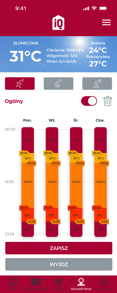
After consultations with the client and the programming team, I took into account all comments regarding required changes in the information architecture, time-consuming implementation of individual elements, comments regarding colors and the client's needs regarding the final appearance of the application. The application screens were made in dark colors, but during the work, the client asked to also prepare daytime screens, which did not involve changing the color.


